We had an excellent response to our second healthcare advertising brief for One Minute Briefs on Tuesday. In case you missed our posts about this competition being run by Advertising Health and Wellmark.
Last Tuesday was WHO World Health Day, and this year the theme was ‘safe food’. So we invited people to create an ad to raise awareness of safe food practices, based on the following brief.
More than 60 entries were submitted, and the responses reflected a broad range of creative approaches. It’s fair to say that some could have done with more supporting copy, but given the ‘one minute’ rule, the entries were judged on their conceptual strength rather than their suitability as finished ads.
The general standard was high, but the following entries were the best (in our opinion).
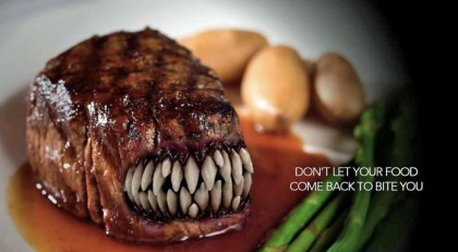
The overall winner was this ad by Garrick Middleton (@garrickmidd).
The most obvious feature here is the striking image, which practically demands the viewer’s attention. The importance of an ad ‘cutting through’ like this (if you’ll pardon the pun) simply can’t be overstated. And the copy complements the image beautifully: a clever play on words that nevertheless conveys a clear message. Nicely done.
We thought that the following entries, in no particular order, were also worthy contenders.
Rich Bayley (@richbayley80) submitted this dodgy character.
Again, this is an ad that captures one’s attention because of the unusual nature of the image. More than that, though, its (admittedly perverse) charm demonstrates that humour can still have a place when communicating serious messages. And it’s also an eminently campaignable concept – you can imagine a guilty chicken or pig working well too. A fine idea.
There was this one from Stephen Hunter (@stephenhunter21) – although a very similar idea was also submitted by Matthew Wyatt (@matthew_wyatt).
Simplicity can be powerful in advertising, as this ad shows. With barely any copy and a veritable expanse of white space, the ad’s physical demonstration of its message avoids the all-too-common problem of overcomplication.
Jay Sangha (@jay_pegg) was thinking inside the box for this one.
The strength of this ad derives from the intrigue created by the image, together with the payoff delivered by the copy line. Simple and effective.
This scamp was the work of Olly Cooper (@worldofolly).
Less ‘polished’ than many other entries, this neatly shows that advertising is not all about technological gimmicks and expensive photography. Rather, it’s just a good creative idea, which would lend itself particularly well to a TVC.
This was the handiwork of Leanne Worthington (@leaworthington).
Wordplay can be risky in advertising, but (in my opinion) this copy is clever without falling into the trap of being ‘too clever’. And the image is strong too.
And finally there was this idea from Think Big Creative (@thebigcreative).
Sometimes a visual pun can work really well, and I think this is a good example.
Congratulations to the winners, and thank you to everyone who submitted entries. Let’s hope that the message got through to some consumers.
Written By Ryan Wallman @wellmark_health.


Leave a Reply